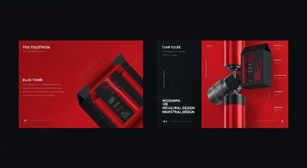

Graf Marketing was developed as a focused brochure – graphic design case study, built around a clear visual system, direct messaging, and a flexible presentation framework that can scale across digital and printed touchpoints.
The work started with research into the brand context, audience expectations, and the practical constraints of the project. From there, the visual direction was refined into a clean structure: confident typography, purposeful spacing, image-led storytelling, and reusable design components that keep the experience consistent.
Key decisions were tested against real usage: how quickly the viewer understands the offer, how naturally the content can expand, and whether the visual rhythm remains clear across different formats. This made the final system easier to maintain while still giving the project a distinctive voice.
Every screen and asset was designed to feel intentional rather than decorative. The final direction gives the project a sharper identity, stronger hierarchy, and enough flexibility for future updates without losing the original design language.