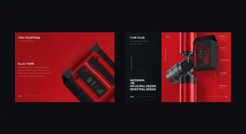

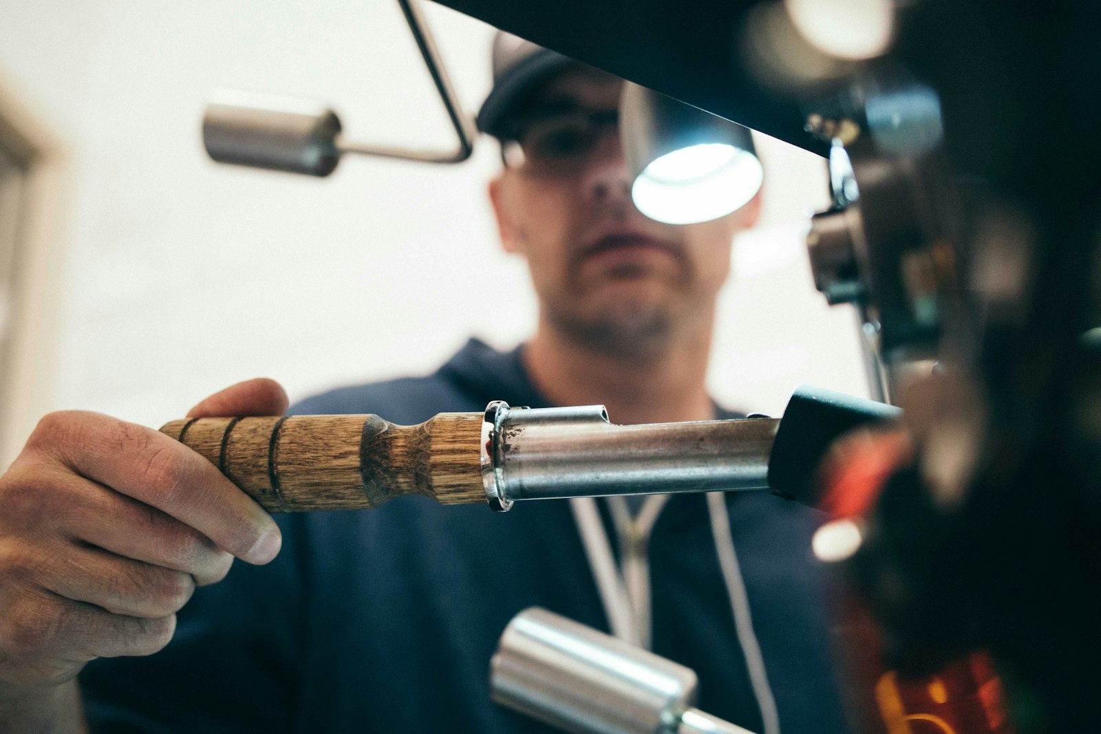
A full brand identity system for Aeroprodukt Zrt., developed alongside a company repositioning from a regional supplier to an internationally certified precision engineering partner.
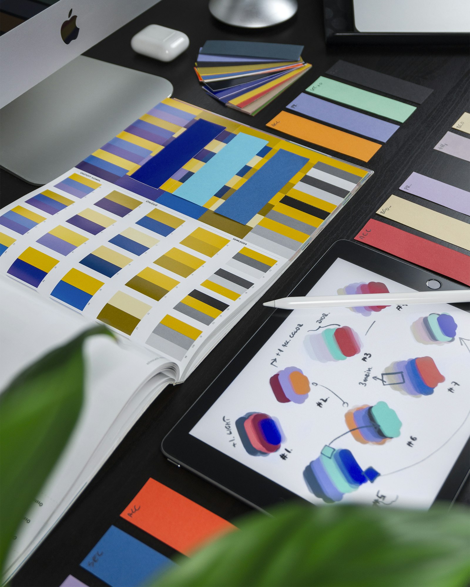
The new identity draws from industrial precision — geometric forms, structured typography (custom-modified sans-serif), and a palette built around slate grey, white, and a single accent blue. Every brand touchpoint, from business cards to factory signage to tender documents, was redesigned within the new system.
The brand guidelines cover logo usage, typography, colour, photography style, and tone of voice — ensuring consistency across all markets.